This Identity project allows me to focus on my personal brand. For this activity I did research to find out more about myself, what styles I like, and what my target audience is. Facebook and Instagram were some great resources into seeing what others not only thought of me but words they first think of when they think of Brittany Austin. Pinterest was another source and something I rely heavily on for daily inspiration to really understand more about what I like and how I want to brand myself. Ultimately this activity will help me really begin to understand how I would like to see a logo for myself.
PINTEREST ACTIVITY:
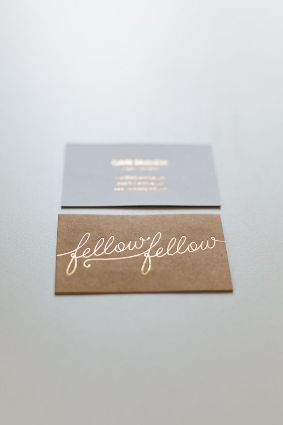
This is my favorite logo I found on Pinterest. The logo was designed by Claire from Fellow Fellow. I have loved this logo for a while because of the simplicity of it. I love the cursive/script almost hand written look of the words and the metallic gold lettering. I also love the neutral and natural colors of the business card. To read her blog post about the design follow this link.
To see more of my pins follow this link.
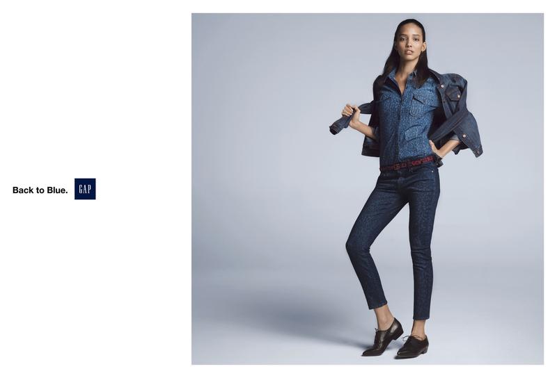
The elements that I seemed to continue to pin were very simple and timeless. I like lots of white space, watercolors, hand drawn florals, script and sans serif fonts, black and white, light pinks, and metallics.
FACEBOOK CHARACTERISTIC SURVEY:
For my social media survey I went to Facebook and posted:
“I am doing a personal branding project for one of my classes this semester and I need to find some words that you think define me as a person.”
I got a variety of responses and compiled the words used most to describe me:
 The top ten responses included:
classy, humorous, smart, beautiful, talented, refreshing, creative, quick witted, happy, & simplistic
From this survey I learned what others, specifically people who know me think about me. I was pleased to receive a lot of really positive feedback about myself and it felt like a bit of a confidence booster. I think a few of the words are things I strive to be like and I was shocked that a few people saw the same attribute in me that I never really picked up on.
My logo that I am going to create is going to be a very large part of my career. It is the first thing that potential employers, clients, ad agencies, and photographers will see. The logo that I will create will be based off of this information and my inspiration. I am hoping to be able to catch people’s attention and help them to see me through a logo because its my brand identity.
TIMELINE:
Jan 13 (Tues) – Have 30 sketches of logos
Jan 15 (Thurs) – Try out colors, fonts, etc. and refine
Jan 17 (Sat) – Vectorize logos
Jan 20 (Tues) – Clean up & Refine vector logos
Jan 22 (Thurs) – Present Identity Project
Jan 23 (Fri) – Video Presentation of Project


